Vor einigen Monaten erschien die Automation Engine Version 12.1. Gleichzeitig wurden wir aber auch mit einem Major Release für die Analytics beglückt.
Die AE 12.1 verwendet jetzt Analytics 2.0.
In dieser neuen Version hat Analytics zwei neue Komponenten bekommen: die Streaming Plattform und die Event Engine (manchmal auch Rules Engine genannt).
Damit besteht Analytics jetzt aus insgesamt fünf Komponenten:
AWI Analytics Plugin
Das AWI Analytics Plugin wird benötigt, damit das AWI mit Analytics kommunizieren kann.
Analytics Backend
Das Analytics Backend ist das zentrale Java-Programm der Analytics Plattform. Seine Aufgaben:
- Daten aus AE und ARA Datenbanken holen, um sie in den Analytics Datastore zu kopieren
- Berechnungen erledigen
- Mittels eingebettetem Tomcat ein Rest-API zur Kommunikation mit der Analytics Plattform zur Verfügung stellen
- Seit V12.1 kann es auch als Agent direkt mit der AE sprechen, sofern eine entsprechende Lizenz dafür vorhanden ist
Datastore
Eine PostgreSQL Datenbank in der sowohl Konfigurationsdaten der Plattform (z.B. Zugriffsschlüssel für das Analytics Backend) als auch Daten für die Datenanalyse gespeichert werden. Letzteres sind derzeit Ausführungen von Jobs und Workflows, Serviceerfüllungen und -verletzungen sowie einige ARA-Daten.
Streaming Platform
Apache Kafka dient als Streaming Platform.
Event Engine / Rules Engine
Apache Flink dient als Event Engine.
Die Streaming Platform und die Event Engine werden für Intelligent Automation benötigt. Dazu werde ich ein anderes Mal noch ausführlicher schreiben.
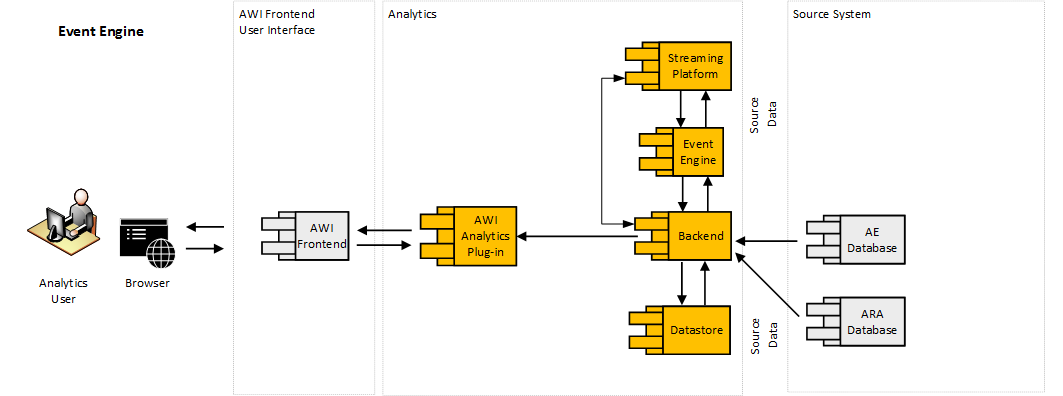
Alle Komponenten der Analytics 2.0 Plattform in Orange
Neue Features in den Analytics 2.0
Neue Komponenten ohne neue Features wären nicht sonderlich spannend. Aber natürlich gab es auch einige Änderungen am Funktionsumfang.
Das alte Feature Analytics and Reporting wurde nicht erweitert, aber gleich drei neue kamen dafür hinzu:
- Analytics Reporting for External Data
- Event Engine
- Data Collection Service
Mit der Event Engine und dem Data Collection Service werde ich mich in einem anderen Artikel beschäftigen, heute geht es um Analytics Reporting for External Data.
Allen, die schon ein wenig mehr über die anderen Funktionen erfahren wollen, kann in ich mal wieder die Automics Dokumentation empfehlen. Dort findet man eine gute Einführung in die Analytics 2.0.
Analytics und Reporting für externe Daten
Kurz zur Info vorneweg: Dieses Feature ist lizenzpflichtig. Um es nutzen zu können, benötigt man die Lizenz ADD.VaraChart. Diese bekommt man kostenlos, wenn man über eine Lizenz für das Produkt Automic Predictive Analytics verfügt.
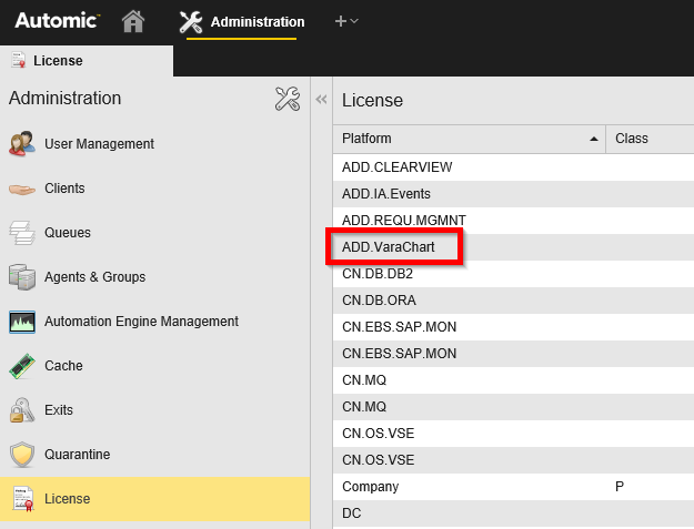
Diese Lizenz braucht man, um Analytics and Reporting for External Data zu nutzen.
Diese Lizenz schaltet einen neuen Widget-Typ für Analytics frei: Das Widget VARA als Diagramm beziehungsweise VARA to Chart im Englischen.
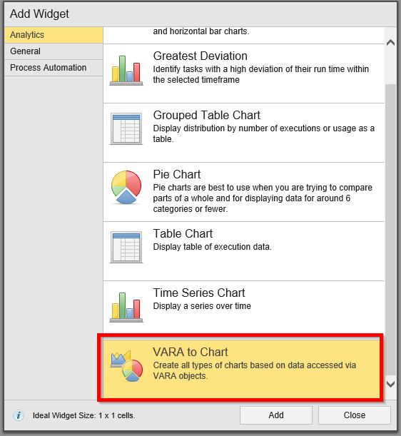
Die Widget-Auswahl mit VARA to Chart.
Obwohl VARA to Chart unter den Analytics-Widgets gelistet ist, unterscheidet es sich doch signifikant von den anderen Widgets dieser Liste.
Normalerweise wird bei Analytics Widgets die Datenquelle Dashboard-weit eingestellt und basiert immer auf den Daten aus dem Analytics Datastore. Wie der Name schon verrät, ist das bei VARA to Chart anders.
Hier kommen die Daten für das Diagramm aus einem Variablen-Objekt, also aus einer VARA. Das können statische VARAs sein oder dynamische VARAs, wie beispielsweise SQL-Variablen oder EXEC-Variablen.
Man kann damit also alle externen Daten visualisieren, die sich per VARA bereitstellen lassen. Daher nennt sich das Feature auch Reporting für externe Daten (beziehungsweise External Data Reporting).
Beispiele zur Nutzung des Features
Eigentlich hatte ich vor, VARA to Chart anhand einiger Beispiele genauer vorzustellen – aber Automic ist mir schon zuvorgekommen. Die Automic Dokumentation zu Vara to Chart enthält bereits drei exzellente Beispiele, so dass ich mir die zusätzliche Arbeit auch einfach sparen kann.
V12.1 hat in der Tat die beste und vollständigste Dokumentation, die Automic je geliefert hat.
Ein paar kleine Anmerkungen zu den Beispielen will ich aber trotzdem noch machen.
Doku-Beispiel 1: Verwendung einer statischen VARA
Das erste Beispiel in der Doku zeigt, wie man eine statische VARA benutzen kann. Mit der statischen VARA ALPHA_SPORTS_SALES_EMEA wird zuerst ein Tortendiagramm und dann ein mehrreihiges Balkendiagramm erstellt.
Dabei sollte man noch die folgenden Dinge beachten:
- Torten- und Ringdiagramme können nur einreihige Daten visualisieren, alle anderen Diagrammtypen schaffen auch mehrreihige Daten.
- Bei mehrreihigen Daten ist das VARA to Chart Widget auf die ersten 5 Wertespalten limitiert. Zusammen mit der Label-Spalte hat man also 6 Spalten.
- Der Screenshot beim mehrreihigen Balkendiagramm im Beispiel zeigt, wie die Bezeichnungen für die einzelnen Datenreihen (Q1, Q2, Q3 und Q4) hardcodiert werden.
Momentan muss man das beim VARA to Chart Widget tatsächlich so machen. Gleiches gilt auch, wenn man dynamische VARAs als Datenquelle benutzt. Die Spaltentitel gehen verloren und man muss die Bezeichnungen händisch eintragen.
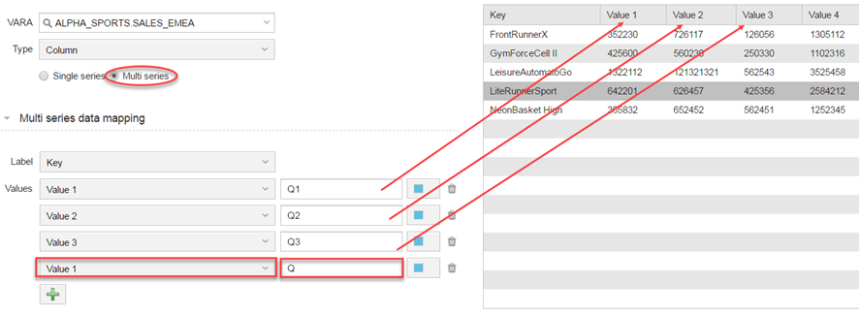
Alle Bezeichnungen für Datenreihen müssen hardcodiert werden.
- Am Ende des Beispiels wird das Dashboard geteilt. Dabei wird ein Hinweis eingeblendet: „Diese Funktion ist im aktuellen Release nicht verfügbar.“
Deshalb vermute ich, dass man in Zukunft VARA to Chart Widgets freigeben kann, so wie es für die anderen Analytics-Widgets jetzt bereits funktioniert. Ich bin gespannt, ob ich damit richtig liege.
Doku-Beispiel 2: SQLI Variablen
Im zweiten Beispiel werden SQL-Abfragen in SQLI-Variablen angelegt, die danach als Datenbasis für die Visualisierung dienen.
Wieder habe ich einige Hinweise dazu:
- Die verwendeten SQLs funktionieren nur auf Microsoft SQL Server.
- Die Logins pro Stunde (VARA.USER_LOGINS_LAST_FULL_24H.INCL_UNIQUE) berücksichtigen keine Zeitzonen, es werden also die Logins je Stunde in der Zeitzone UTC ausgewertet, da alle Zeitstempel in der Automic DB in UTC gespeichert sind.
- Bei allen drei Beispielen sieht man schön, dass die Daten bereits in der SQL-Abfrage aggregiert werden (GROUP BY Funktionen). Das ist auch nötig, denn im Gegensatz zu den Analytics-Widgets kann das VARA to Chart Widget selbst keine Datenaggregierung vornehmen. Die Daten müssen vom VARA schon fertig aggregiert bereitgestellt werden.
Doku-Beispiel 3: VARA.EXEC
Im dritten Beispiel der Doku wird eine VARA.EXEC in Kombination mit einem Rest Webservice Job verwendet, um Wetterdaten (die Wettervorhersage für Wien) zu visualisieren.
Die Daten kommen vom RestAPI von openweathermap.org, werden per Webservice Job abgefragt und in der VARA.EXEC visualisiert.
Dafür wird eine Besonderheit der VARA.EXEC genutzt, die seit V12.1 (endlich!) auch in der Dokumentation beschrieben wird: Greift man mit der VARA.EXEC auf den Rückgabewert einer SAVE_PROCESS Anweisung zu, dann erhält man die gespeicherte Datensequenz als VARA .
Ein sehr cooles Feature!
Vergleich sonstiger Analytics Widgets mit VARA to Chart
| VARA-to-Chart | Sonstige Analytics Widgets | |
|---|---|---|
| Verwendet Dashboard-weite Datenquelle aus der Analytics DB | x | |
| Eigenes Widget pro Diagramm-Typ | x | |
| Kann geteilt werden, d.h. über öffentlichen Link zugänglich gemacht werden | x | |
| Kann Aggregatfunktionen auf Datenquelle ausführen | x | |
| Eigene Lizenz nötig | x | |
| Widget hat eigene Datenquelle | x | |
| Diagramm-Typ im Widget auswählbar | x | |
| Unterstützt mehrreihige Diagramme | x |
Wie man an diesen Beispielen schon sehen kann, bietet Analytics in der neuen Version noch einmal deutlich mehr Möglichkeiten. Die alten Features sind aber natürlich alle erhalten geblieben und ich kann jedem nur raten, sich damit auseinanderzusetzen.
Eine Möglichkeit dafür ist mein kostenloses E-Learning, in dem zwar bisher noch nicht VARA to Chart behandelt wird, ansonsten aber alles, was man über die Analytics Widgets und ihre Verwendung wissen muss.


